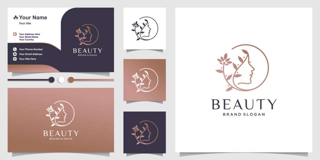

In the highly competitive beauty and cosmetic industry, branding and presentation play a crucial role in attracting and retaining clients. One of the most impactful elements of branding is the choice of colors and fonts. Soft tone colors and creative fonts can evoke specific feelings and responses from consumers, significantly influencing their perception of a brand. Here’s a closer look at how these design choices affect consumer psychology in the beauty and cosmetic sector.
The Power of Soft Tone Colors
Calmness and Serenity: Soft tone colors, such as pastels (light blues, pinks, lavenders, and greens), are often associated with calmness and tranquility. These colors can create a soothing atmosphere that resonates well with clients seeking beauty treatments, making them feel more relaxed and comfortable when visiting a clinic or purchasing products.
Femininity and Elegance: Soft colors are frequently linked to femininity, grace, and elegance. In the beauty industry, where products and services often target women, pastel hues can create an appealing and inviting image, aligning well with the ideals of beauty and softness.
Approachability and Warmth: Brands that use soft tones tend to appear more approachable and friendly. This encourages potential clients to engage with the brand and reduces feelings of intimidation that may arise from more aggressive or bold color choices.
Luxury and Quality: Soft tones can also convey a sense of luxury and high quality. When used effectively, they can suggest that a brand prioritizes elegance and sophistication, which is particularly appealing in the premium beauty market.
The Impact of Creative Fonts
Brand Personality: The font style can articulate a brand’s personality and values. Creative and artistic fonts may signal innovation, playfulness, and a modern approach, while more classic and elegant fonts may evoke tradition and reliability. In the beauty industry, it’s essential to find a balance that aligns with the brand’s identity.
Readability and Accessibility: While creativity in fonts is important, readability should not be compromised. A well-chosen font that is easy to read can enhance the user experience, making it more likely that potential clients will engage with the brand’s messaging.
Emotional Connection: Just as colors evoke emotions, fonts can also create emotional connections. Curvy, flowing fonts may elicit feelings of warmth and softness, while sharper, more geometric fonts can create a sense of modernity and professionalism. The right typeface can resonate with the target audience and foster loyalty.
Differentiation: In a saturated market, unique fonts can set a brand apart from competitors. A distinctive font helps establish recognition and can make the brand more memorable. This differentiation is vital in attracting clients looking for personalized and exclusive beauty experiences.
Combining Colors and Fonts for Maximum Impact
The interplay between soft tone colors and creative fonts is essential for building a cohesive brand identity. When these elements are harmoniously combined, they can amplify the intended message and enhance the overall aesthetic appeal of the brand.
Consistency is Key: Consistently using a specific color palette and font across all branding materials—including packaging, social media, and advertising—reinforces brand identity and builds trust with consumers.
Target Audience Consideration: Understanding the target demographic is crucial when selecting colors and fonts. Researching consumer preferences can guide effective design choices that resonate with the intended audience.
Creating a Visual Hierarchy: Utilize color intensity and font weight to establish a visual hierarchy on marketing materials, guiding consumers through the information in a way that feels intuitive and pleasing.
Conclusion
The psychology of soft tone colors and creative fonts in the beauty and cosmetic industry plays a vital role in shaping consumer perceptions and experiences. By thoughtfully considering these design elements, brands can effectively communicate their values, evoke the desired emotions, and create a lasting impact in the minds of their clients. Ultimately, a well-executed combination of colors and fonts can lead to stronger brand loyalty and increased client engagement in a competitive marketplace.


